
Build Club X
The X system on the web — dark-first, dual-persona, one accent at a time.
How Build Club X shows up on the web — the system proven on the live consulting site, which is the master reference. The brand book's monochrome severity relaxes into a charcoal (never pure black) canvas with a porcelain light mode; lime speaks to companies and a periwinkle answers for the builders who moonlight; and the textures — waven waves, scanlines, a night sky, a blurred holographic blob or a halftone moon in the corner, a ghost pixel-X — decorate at whisper opacity while content stays monochrome.
The live Build Club X consulting site is the reference implementation of this system. The V1 brand book (pure black, print + social rules, the parametric logo maker) is archived on the Build Club X brand-book page.
The web canvas is charcoal (#18181B) with raised graphite surfaces; the light mode is warm porcelain, never clinical white. Pure black stays in the brand book, print, and social.
Lime speaks to companies, periwinkle to the builders who moonlight — carried by tag dots, primary CTAs, and whatever occupies the hero's top-right corner. Never both at once.
Waven waves, scanlines, a blurred holographic blob, a night sky, and a ghost pixel-X decorate every canvas below ~13% opacity — content stays monochrome and does the talking.
Every marketing surface opens on the same stationary canvas: four texture layers under the first fold, all at whisper opacity. On the site it lives in the persistent layout, so persona switches slide the content over it — the backdrop never moves.
For companies
Find the right AI expert for any project
Vetted AI consultants, engineers and agencies backed by 70,000 builders. Tell us what you need and we'll make the intro.
The four layers, bottom to top
1. waven pattern · repeat · 13% opacity · masked to fade downward
2. scanlines · repeating-linear-gradient(0deg, rgb(255 255 255 / .04) 0 1px, transparent 1px 6px)
3. starfield · two tiled star layers, builders only · masked to fade downward
4. the corner · foil blob for companies / halftone moon for builders · top-right
5. pixel-X · currentColor at 3% · anchored right- The backdrop spans only the hero (~36rem) and fades out — the page body returns to the plain canvas.
- One keyword per headline carries the accent; everything else stays monochrome.
- The tag–headline–sub stack is the opening grammar of every surface, hero or section.
- Textures never combine at full strength: waven ≤13%, scanlines ≤5%, ghost mark ≤3%.
- The top-right corner is a single slot with two occupants — the foil blob and the moon — and the persona decides which is in it.
The web system is dark-first, never black: charcoal zinc instead of the brand book's #000000, and a warm porcelain light mode instead of clinical white. The light mode inverts the knockout — and because lime is nearly white (1.1:1 on porcelain), it changes how lime appears, never whether the accent is lime.
Find the right AI expert
Lime sits straight on the canvas — as type, dots, and solid CTAs.
Find the right AI expert
Lime never sits on porcelain. It survives as a highlighter behind black type.
- Dark: lime is type, dots, and solid CTAs. Light: lime is a highlighter behind black type; standalone accents fall back to black.
- The primary CTA on light is a charcoal chip (#2C2C2E) carrying the lime label — the same lime-on-charcoal image dark mode establishes.
- Porcelain neutrals carry a whisper of warmth (#FCFCFB / #F6F5F1 / #EFEEE9 / #E5E3DE) — near-white, never #FFFFFF.
- Textures adapt by knob, not new assets: the waven PNG is white-on-transparent and inverts to ink on light; scanlines flip from white 4% to ink 5%.
The site speaks to two audiences and gives each one accent: lime for companies, periwinkle for the builders who moonlight — the foil's violet stop, lifted so black text sits on it with the same punch as black-on-lime. The accent is carried by the tag dot, the primary CTA, and whatever occupies the hero's top-right corner. Never both in one surface.
For companies
Find the right AI expert for any project
Moonlight with us
Are you a cracked AI engineer?
- The persona accent scopes to the persona's surfaces; shared chrome (header, footer) stays neutral.
- Periwinkle deepens to iris (#6B54F5) for text accents on the light canvas — #A797FF is a fill, not a text color, on porcelain.
- The lime tag dot wears an inset ink ring on light surfaces (like the brand stickers wear their outline); periwinkle holds its own on both.
- The builders persona is addressed as individual engineers, not as agencies: it speaks to people who have shipped AI and want paid client work on their own terms. Moonlighting is the motif, not a condition, so the copy never assumes a day job.
The builders side of the site is about moonlighting — client work taken on in whatever hours the builder chooses — so its surfaces get a night sky and the corner glow becomes a moon. It is a screenprint, not a sphere: the rest of the language is flat and graphic (the pixel-X bitmap, the scanline rhythm, the waven contour field), and a shaded 3D ball sits in it like a photograph glued to a poster. A halftone plate carries every crater instead.
Moonlight with us
Are you a cracked AI engineer?
Moonlight white on charcoal, the sky in white specks.
Moonlight with us
Are you a cracked AI engineer?
Periwinkle on porcelain, the sky in ink specks — a pale disc would vanish.
The disc — two masks intersected
background-color: var(--moon-fill);
mask:
  url(the halftone plate) center / contain no-repeat,
  radial-gradient(circle at 100% 0%, #000 68%, transparent 99%);
mask-composite: intersect;
The plate ships as a white-on-transparent alpha mask, not a picture, so the colour comes from a token and one asset serves both themes. The second mask is a falloff centred on the corner the disc is cropped by — without it a moon this large lands as a flat bright slab with a hard limb.
Night-sky tokens
| Token | Dark | Light |
|---|---|---|
| --moon-fill | #F2EEFD | #A294D6 |
| --moon-glow | rgb(167 151 255 / 0.34) | rgb(107 84 245 / 0.16) |
| --star-color | rgb(255 255 255 / 0.55) | rgb(0 0 0 / 0.16) |
The light-mode moon is cut from the persona periwinkle rather than moonlight white — the same retreat lime makes on porcelain.
01
Apply
02
We read it
03
15 min call
04
First brief
- The four join steps carry the moon waxing crescent → full, so the process reads as one night passing. Use phases only where there are exactly four steps.
- The night sky is two tiled star layers at 317×229 and 419×293 — coprime-ish so their seams never align and the repeat reads as scatter, not grid.
- Never combine the moon and the foil blob in one surface: they share the corner, and the persona decides which one is in it.
- Don't recolour the halftone plate by hand or swap it for a rendered sphere — it is a mask, and the tokens do the colouring.
On the web the foil is rationed to three jobs — a hairline rule (the elevation signal), the aurora Certified text, and the blurred corner blob. Texture uses the supplied pre-blurred asset; only the blob is mixed in CSS, and always from the ink-strength stops.
A 2px slice of the blurred foil. Marks elevation: the footer top, the CTA banner base, the founder-note close.
The certification signal. Pastel stops on dark; the same five hues at ink strength on light (pastels are ~1.3:1 on porcelain).
The hero corner glow — the ink stops as a conic wash under blur(64px). Ink stops even in dark mode.
The two foil ramps
- Texture is always the supplied pre-blurred asset — never a hand-mixed linear gradient.
- The blob is the one CSS-mixed foil: conic from 200°, ink stops, blur(64px), 32% opacity on dark / 14% on light.
- Repeat the first stop at the end of any animated gradient so the aurora pan loops seamlessly.
- Never put a CSS filter on background-clipped foil text — it defeats background-clip and paints a solid pill.
Surfaces
Ramps
Gradients
Click to inspect the stops, direction, and CSS.
Persona accents
Lime speaks to companies, periwinkle (the foil's violet stop, lifted) to the builders who moonlight — never both at once. On the light canvas the lime dot wears an ink ring, and builder text accents deepen to iris.
Core tokens
Applied web tokens, lifted from the live site.
Process
How it works
No upfront cost. Tell us what you need and we handle the matchmaking.
Every section opens identically: a dotted tag (Inter 13px, uppercase, +8% tracking), a display heading, a muted sub. Headings on the web run at −1.5% tracking— the brand book's +4% felt too airy at display sizes with the Space Grotesk stand-in; revisit when the licensed GC North Sans lands.
01
Tell us what you need
Describe your AI challenge. POC, RAG system, strategy, integrations, or training.
02
Get matched
We match you with Build Club Certified experts who specialise in exactly what you need.
03
Start building
Work directly with your expert. We stay involved to ensure quality.
- The index is display-face lime at text-sm; the title display-face at text-xl; body muted.
- Cards are the flat card surface with a hairline border — no shadows, no gradients.
Our partners have worked with



- 45s linear loop, duplicated track, edge fade via mask; hover pauses, reduced motion flattens to a wrapped row.
- Third-party partner logos rest as monochrome silhouettes — brightness(0), inverted on dark — at 60% opacity, and reveal their own colors on hover; never a filter approximation of color.
Maya
AI Strategy
“Board-level AI strategy for a media group”
70K+
Members
50+
Cities
An expert network drawn from the community: builders who learn by shipping, not consultants writing white papers.
- Portraits are always grayscale; "Certified" is aurora foil text; the role reads in lime tags; ratings are lime.
- Stat tiles keep the dark canvas in both themes (a scoped dark island) — the brand textures and lime are authored for dark.
Ready to find your AI expert?
Tell us what you need and we'll match you with the right partner from our certified network.
- Waven masked to fade rightward, scanlines over it, the ghost pixel-X in the corner at 4%.
- The holo rule closes the banner — the foil marks the moment of elevation.
- Primary CTA plus a plain-text secondary path; never two filled buttons.
Motion is sparse and directional. The chrome never animates; content slides over the stationary canvas, and every positional move collapses to an instant swap under reduced motion.
| Moment | Spec |
|---|---|
| Persona switch | Content slides 44px + blur-fades — 440ms cubic-bezier(0.22, 1, 0.36, 1); direction mirrors the switcher (forward = in from the right). Header, footer, and backdrop stay frozen. |
| The corner swap | The blob shrinks and fades out over 560ms while the moon rises in behind it — translate-y-10 → 0, scale 95% → 100%, 720ms. The arrival is delayed 120ms so the two don't cross-dissolve into mush at the midpoint; the delay only applies on the way in. |
| Foil blob | Half-turn (180°) on the companies canvas, as a live transition timed to the content slide. |
| Night sky | The sparser of the two star tiles breathes 25% → 100% opacity, 7s ease-in-out infinite alternate, so the sky shimmers without any one star blinking out. |
| Theme switch | A single expanding circle wipes the new theme over the old (View Transitions API) — no cross-fade. |
| Marquee | 45s linear, seamless duplicated track, pause on hover. |
| Aurora text | 8s ease-in-out, infinite alternate — only background-position animates. |
| Reduced motion | Slides and marquees drop to instant/static; the star of the system is stillness. |

Scanlines — mixed in CSS, themed by one custom property
repeating-linear-gradient(0deg, var(--scanline-color) 0 1px, transparent 1px 6px)
/* dark: rgb(255 255 255 / .04) · light: rgb(28 28 28 / .05) */- Photography is black-and-white only — grayscale portraits let the holographic ring and lime carry the color.
- Never combine two textures at full strength in one space; if nothing fits, use the flat canvas.
- Don't rescale the waven grain — its rhythm breaks; tile it at intrinsic size.
- The moon plate is a mask, not artwork: colour it with a token, and don't flatten it into a coloured PNG.
Everything above specifies the system. This is the collateral built from it — ready-made artwork for surfaces that live outside the site, made from the same canvas, accents and textures so an event page or a deck reads as the same brand as consulting.buildclub.ai.
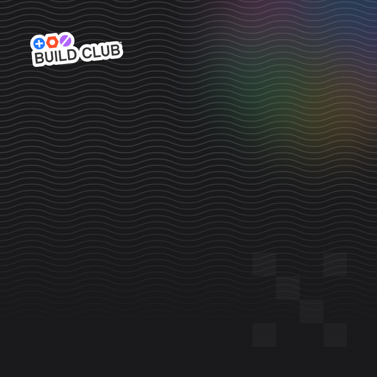
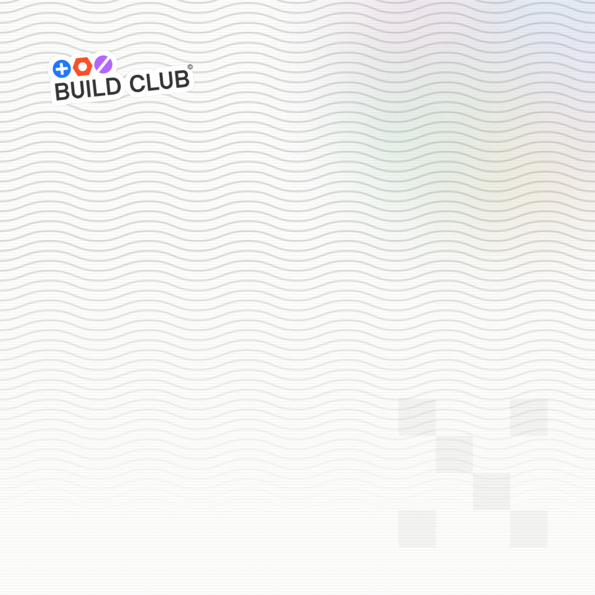
Four square plates carrying the hero canvas and nothing else. Luma shows event covers in a square slot, so 1200×1200 never gets cropped. They are type-free on purpose: set the copy in Canva or Luma.
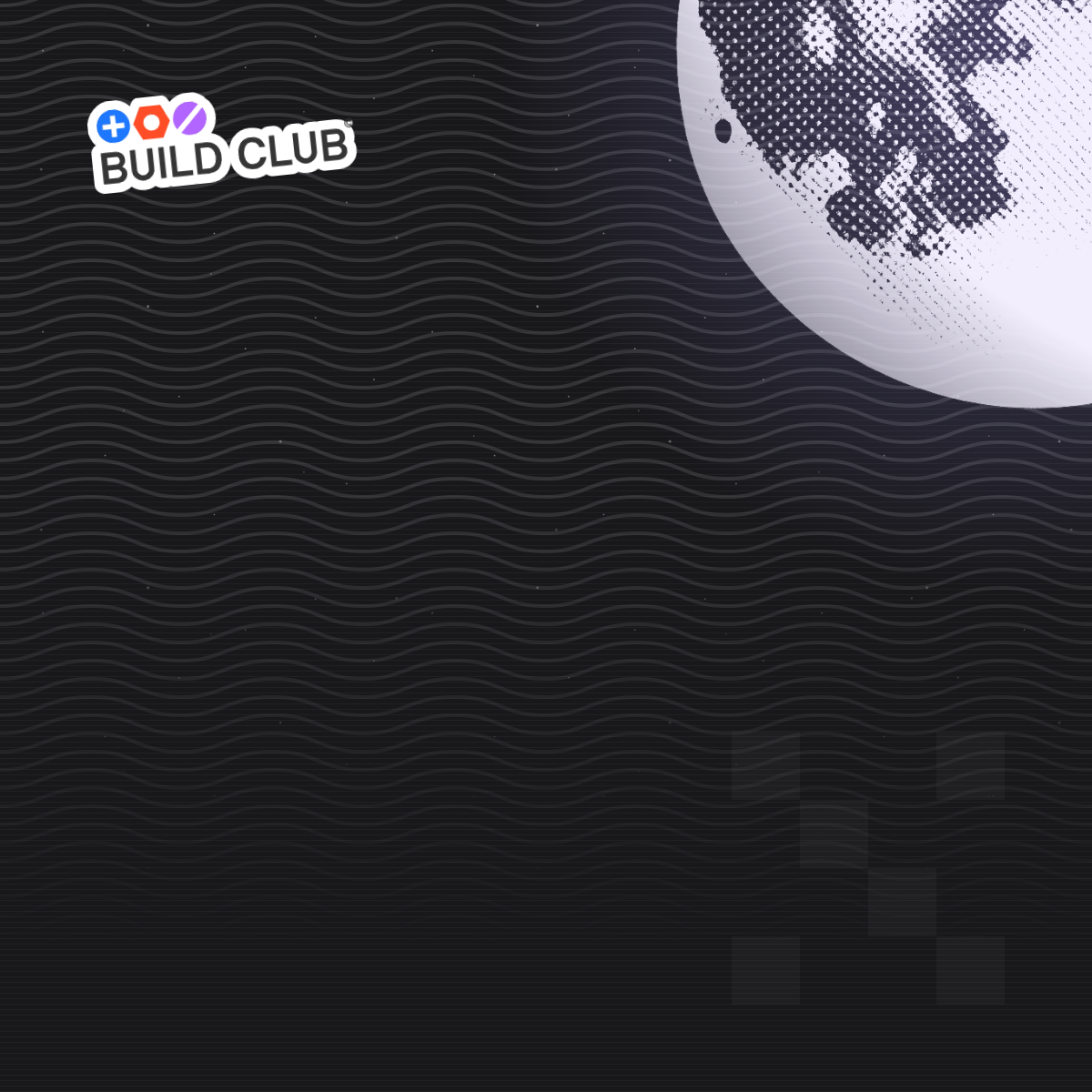
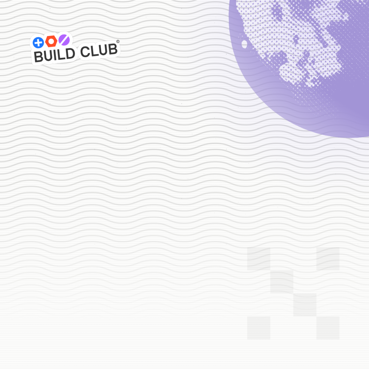
How they are made
The plates are rendered from the live site's own CSS rather than redrawn by hand: the canvas leans on a conic gradient, a 64px blur and an intersected mask pair, so anything traced by eye drifts from the site within a release. Ask an engineer to re-render them whenever the hero canvas changes.
- Set copy in the lower two-thirds: the waven fades downward and the corner motif is anchored top-right, so that field is left clear on purpose.
- The parent Build Club sticker sits top-left at the site's -6° tilt, placed intact — never redrawn, recoloured, or re-tilted.
- The ghost pixel-X sits whole in the opposite corner. Don't crop it here the way the CTA banner does: the mark reads as an X through the outer cells of each row, and losing them leaves three stray diagonal squares.
- Pick the plate by audience, not by taste: the moon is the builders/moonlighting signal and the foil blob is the companies one.
- Match the plate to the surface it lands on — the dark plates are the default; the light pair is for porcelain decks and printed collateral.
- Type set over these follows the brand faces: GC North Sans (Space Grotesk stand-in) for the headline, Inter for everything else.
This brand's logos, fonts, imagery, and downloads live in one folder, nested under the brand. Drop files here and they'll be wired up as they land.
/brands/build-club/x/