Build Club Community
The world's most collaborative AI community.
Build Club Community is the gathering place for builders — 60+ cities, 70K members, by the team behind Solaris. Its identity is loud, optimistic, and tactile: the three-part mark, a sticker-first culture, and a signature holographic foil that any shape, icon, or word can be cut from. Electric blue leads, tangerine punctuates, set in Neue Regrade over Satoshi.
Lower the barrier. The community is for everyone building with AI, in every city — not just the experts.
Identity is tactile and fun. Emoji, pixel, and holographic stickers carry the personality across products and marketing.
60+ cities, 70K members. We name the place and the people — community is specific, not abstract.
Three-shape symbol only.
Square social and app-facing lockup.
Wordmark lockup for wide placements.
The measuring unit ships inside the logo: the blue plus circle. Every mark and lockup keeps one full plus-circle of empty space on the top, bottom, left, and right. More space is always fine; less never is.
Because the unit is part of the artwork, the clear zone scales with the logo automatically — bigger logo, bigger zone.
1× = the plus circle from mark.svg, at whatever size the logo is placed.

The mark is three shapes — a blue plus, a tangerine hexagon nut, and a violet split bean — beside the BUILD CLUB wordmark. Use full colour on light, mono white on a brand-blue chip, mono ink on light. Keep clear space of one plus-circle around the lockup. This grid only shows final logo files; construction/detail vectors remain in logo/ (mark.svg, mark-mono.svg, wordmarks, and lockups).
The mark stays healthy when you measure space with its own plus circle and match the file to the surface underneath it.

Keep one plus-circle of space on every side — the unit is right there in the mark.
Full-colour artwork belongs on white and quiet light neutrals.

White artwork always sits on a dark or saturated brand chip.

Switch to the mono ink mark when full colour would fight nearby art.
Each of these breaks the mark's geometry, colour, or clear zone. If a layout seems to need one, switch to a different approved file — never modify the logo.
HeadlineNo text, edges, art, or stickers enter the plus-circle zone.
The shapes stay blue, tangerine, and violet — no exceptions.
Scale proportionally and keep the baseline level.
No drop shadows, outlines, glows, or texture fills.
Put a chip or the reverse file behind it instead of fighting the background.
The full lockup stays visible, clear space and all.
Logo artwork is not a window for photos, gradients, or foil.
Never mirror, redraw, or reorder the three shapes.
Legacy raster placements plus the die-cut sticker treatments of the mark — everything here is deduplicated against the approved logo matrix above, so each artwork appears exactly once. Prefer the matrix for new work; reach for these when matching legacy Campus placements or producing physical stickers.
The diagonal app-icon mark plus raster exports from the Campus app that have no equivalent in the matrix.



Surfaces
Ramps
Gradients
Click to inspect the stops, direction, and CSS.
Community accessory pairs
Extra Build Club Community pairs. Use the deep tone with its paired light tint.
Functional
System states — a light surface with a deep icon, or reversed.
Tier / Leaderboard
Rank tiers shared across brands — each a metallic gradient.
Core tokens
Shared by every brand.
- Say "anyone can" — lower the barrier.
- Lead with momentum and shipping.
- Name the city and the people — it's a community.
- Let the stickers carry the fun.
- Don't gatekeep or sound elite.
- Don't be corporate or flat.
- Don't overuse the foil — it's a highlight, not a background.
- Don't blur into the other Build Club brands.
A faint perspective grid on white, the iridescent holographic foil as the signature surface, the globe for “60+ cities”, and scattered stickers with a little rotation. Sparkles punctuate.


Base radius drives every surface via --radius.
Every element reads the brand's live Tailwind tokens — no per-brand markup.
How Community shows up in the world. Two systems carry the brand at events and online — the poster and the stickers — and each has an editable studio for producing new, on-brand artwork.
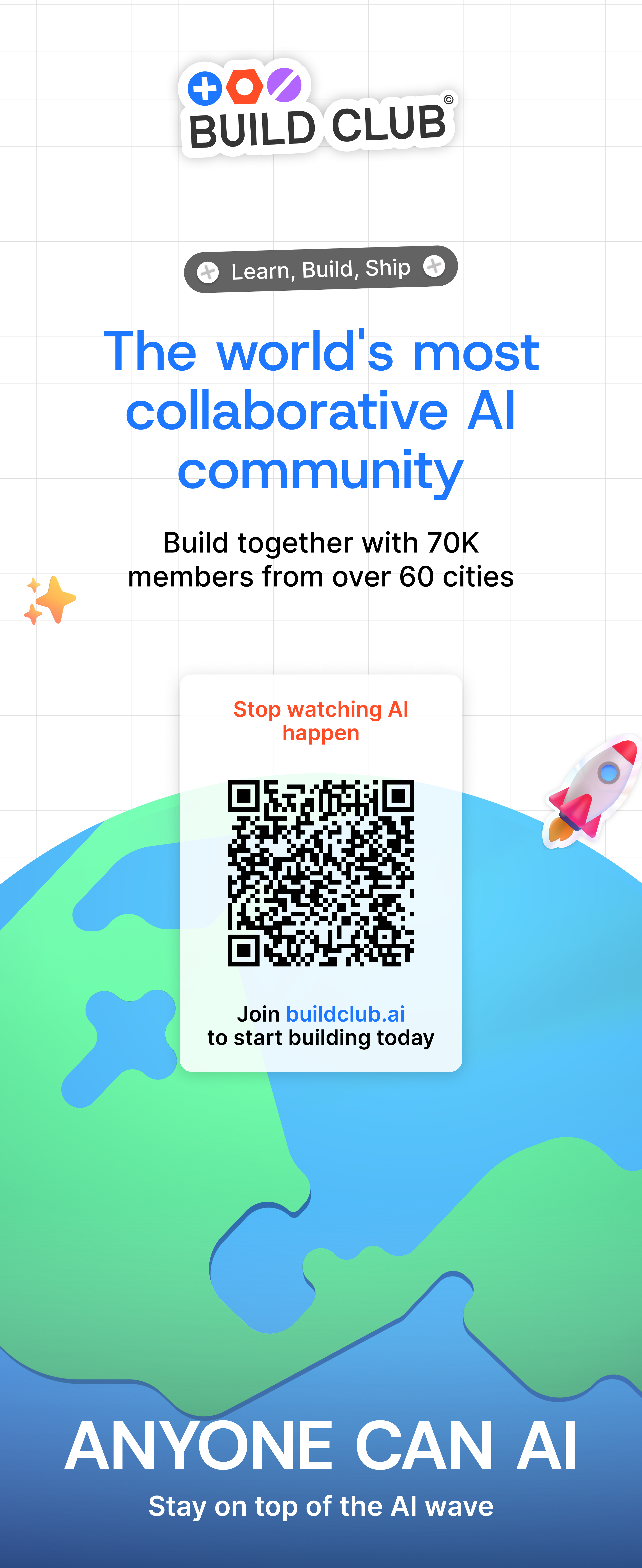
The Community roll-up banner is the reference application for the brand at events: the faint perspective grid, the electric-blue headline, the sticker lockup, the globe, and a scannable QR card — finished with the holographic rocket.
- •Print from the supplied full-resolution file; do not re-lay-out the artwork.
- •Keep the sticker Build Club lockup, globe, and holographic rocket as supplied.
- •Keep the QR block and buildclub.ai URL unedited so the call to action stays scannable.
- •Don't recolor the electric-blue headline or swap the grid background.
Need a variant? Rewrite the headline, stats, or call to action and generate one on-brand instead of re-laying-out the artwork.
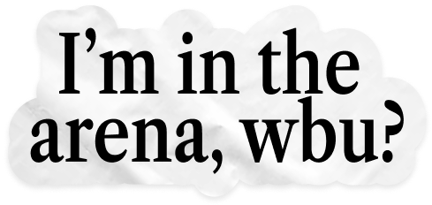
Stickers play a significant role in the identity of Build Club — a wide variety of them, combined freely, give the products and marketing their flavour. Three families work together; the logo stickers live with the additional logos above.
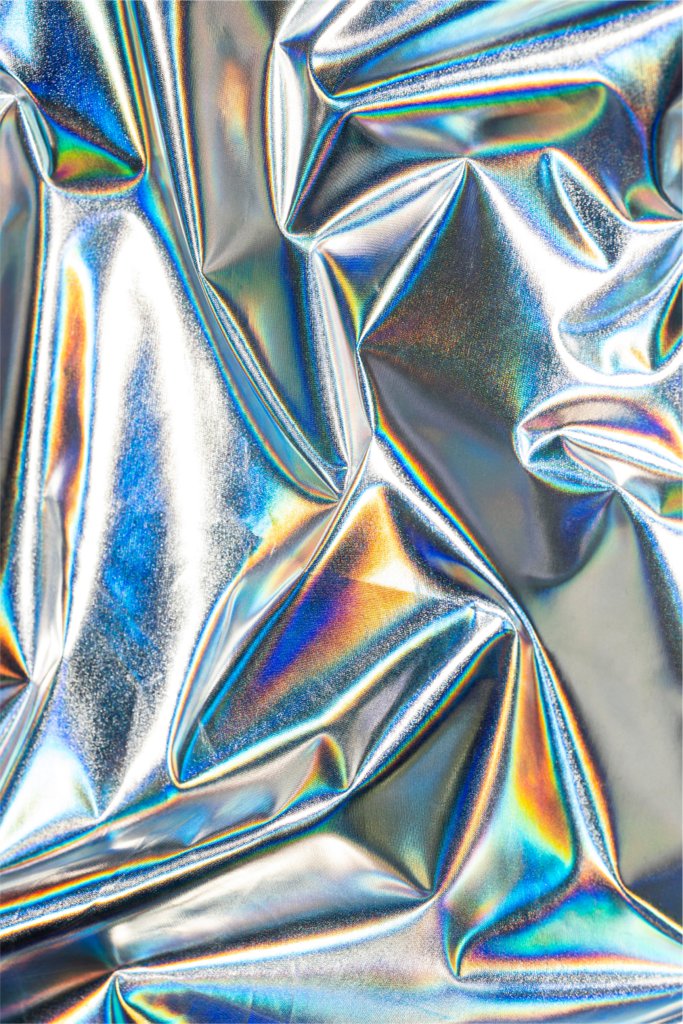
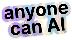
Every shiny sticker is one move: a metallic base plus the holographic foil, masked to a word or traced around transparent artwork. Text keeps the black-on-foil extrude; emoji, pixel, and logo art sit on holographic outlines.


Emoji stickers
32The primary collection — 3D emoji that reuse the same iconography as the interface, for consistency.



















Shiny — holographic foils
6The signature treatment. These are the raw foil assets; Sticker Studio only uses the approved Holographic (large), Foil (square), and white patch options.