Physical Marketing
The Solaris brand in the physical world — banners, events, and print.
This page is deprecated. Its sunburst banner palette is kept only as an archive for existing print collateral — new marketing work uses the Solaris Marketing system. Go to Solaris Marketing →
Solaris is the enterprise product that brings a Build Club community — and everything Build Club offers — inside a company. This page archives the earlier physical-marketing identity: sun-yellow and peach starbursts over a cream canvas with deep cocoa ink, set in the Brawler serif. Its starburst motif lives on in the Solaris Marketing system; its palette does not.
Considered, generous spacing and a serif voice — built to feel high-end.
Brawler headlines and quiet color let the content read like a publication.
Sits comfortably alongside the most serious brands and IT requirements.
Action accents
The Build / Log / Browse starburst trio. The accent colors the star and its label; cards pair it with the tint surface and ink headings; badges set the accent at 10% fill / 20% stroke.
Surfaces
Solaris logos are supplied as ready-made SVG. The SOLARIS wordmark is set in Hedvig Letters Sans (80px), outlined into fixed artwork; typography in the guide remains Brawler.
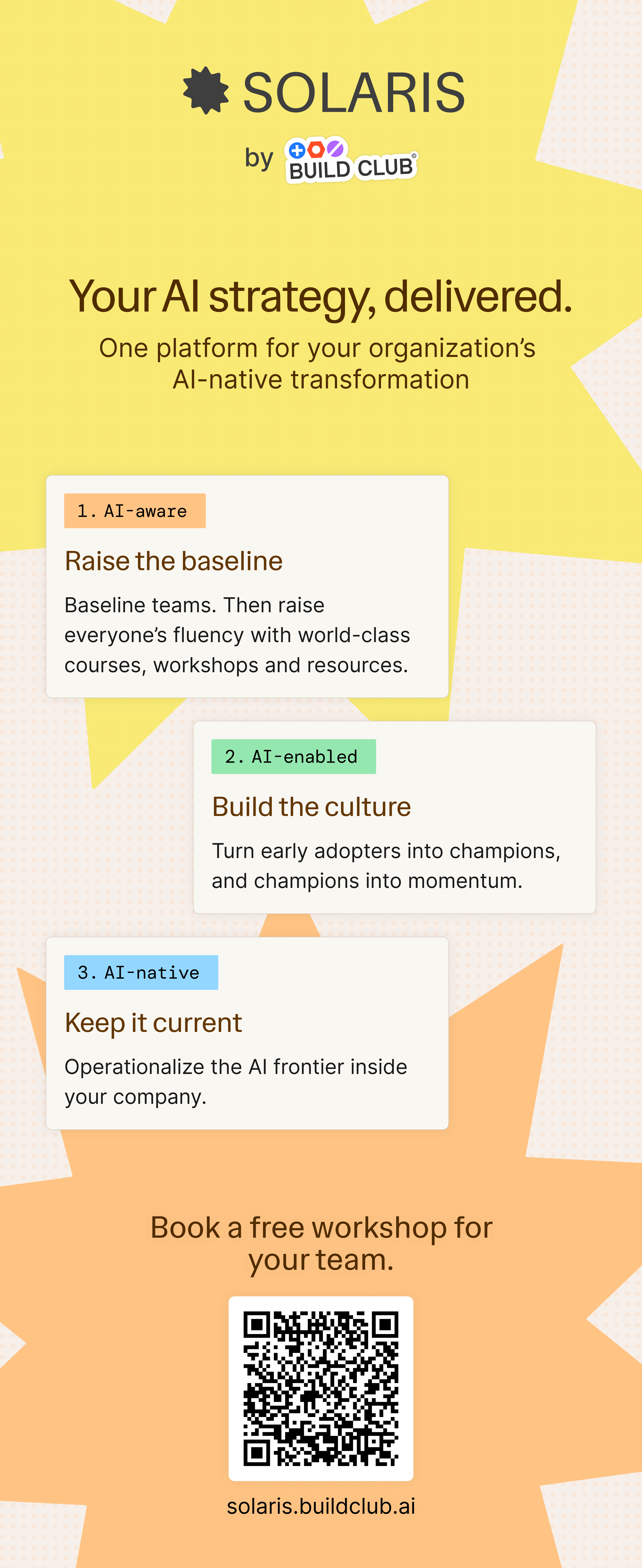
The Solaris roll-up banner is the reference application for the brand: the cream canvas, sun-yellow and peach starbursts, cocoa serif display, and the three AI-stage cards. It is also the source of the brand's signature colors shown in the Color section.
- •Print from the supplied full-resolution file; do not re-lay-out the artwork.
- •The sunburst palette (Sun, Peach, Cream, Cocoa) is the Solaris brand voice — keep it intact.
- •The Build Club lockup inside the banner keeps its own Community colors; never recolor it.
- •Keep the QR block and solaris.buildclub.ai URL unedited so the call to action stays scannable.